A Report from Austrian Art Exhibition in Vista Art Gallery
Headings
Introduction
Introduction of Artists’ name and their artworks
Common form of the present artwork in “where are we” Exhibition
Separate study of present artworks in the Exhibition
References
Feuilleton
Introduction:
Vista Art Gallery hosted Austrian Artists in June, 5th 2015.
LisI Ponger, Niko Wahl, Nives Widauer, Clemense Krauss, Constantin Luser, Maria Seifert, Vooria Aria, and Siegfried A. Fruhauf were the artists whose artworks have been exhibited in forms of photos, layouts, and films as an intercultural exhibition. (Where are we?)
This exhibition was the result of cooperation of Hinterland Gallery from Vienna/Austria with Austrian cultural Forum and Swiss embassy in Tehran/Iran and also with Vista Art Gallery curated by Gudrun Wallen Bock.
First the names and artworks (media) of each Artist are introduced and then we peer into their possible approaches to their own artworks.
Lisl Ponger born in Germany in 1947 with a 12-minute video named “Passage” created in 1996.
Niko Wahl born in Austria in 1974 with a layout named “Tehran in a tent” created in 2015.
Nives Widauer born in Switzerland in 1965 with a layout named “Pomegranate” created in 2015.
Clemens Krauss born in Austria in 1979 with a series of photographs named “7 saints” created in 2009.
Constantin Luser born in Austria in 1979, with a layout named “striptease” created in 2009.
Vooria Aria born in Iran in 1979, with a layout named “Perishable” created in 2015.
Siegfried A. Fuhauf born in Austria in 1976, with a 4-minute video named “Hohenrausch” (Mountain Trip) created in 1999.
• Common form of the present artworks of “Where are we?” exhibition.
Before studying the Artists’ artworks one by one, it is better to look at the common form presented in all artworks.
Nonnative, physical and mental travel, moving from one place to another one or from one time to another one, from a belief and ideology to another belief and ideology. Showing the traces of these replacements on our body and soul and challenging immobility in one point of a place, time, and belief. Some of these Artists’ travel to Iran at the time the exhibition was held and their physical attendance emphasizes on the conceptual aspect of this exhibition.
Frankness in expressing the concept of the artworks and avoiding ambiguity and allegoricalness were the other common forms of the artworks, therefor, Iranians didn’t need much more especial knowledge or information understanding them and if needed any, some information has been offered by the artist in his/her statement.
• Separate Study of the present artworks in the exhibition
“Passage” by Lisl Ponger was a color video in 3×2 cm frame which was screened on the wall of the exhibition by a video projection. For introducing this artwork this paragraph was written in the exhibition catalogue: Lisl Ponger has long explored the constructed nature of (cultural) identity, our-often stereotypical-ideas about the image of “the other”, and the associated questions of visual representation. In her film “passage”, Lisl Ponger creates an imaginary map of the twentieth century on which the stories of emigrants are engraved like well-worn tracks of western memoire. The photos that were taken by the tourists which were present there, appear in a stressful relation with sound track to show a post-colonial travel, the lines of countries which were hung together in the past in atmosphere and time.
The video showed non-narrative pictures, relating to past, a set of dim pictures which technically expressed that these pictures were too old, that in old past were taken with old devices in that era by the tourists, pictures screened on the wall of the exhibition made you imagine stretching from past to present, it is like that these travelers are always travelling, a travel whose destination is just travel. In her conceptual artwork, Lisl draws the viewer’s mind away from aesthetic forms in the artwork and instead floats their mind into the common memoires they have by these pictures.
Moments of anxiety, untold of travel, excitement for the moment you will face, replacement of the moments, in a place never you have been, the story of emigration. But these pictures are from the past and the quality of continuous pictures, dotting this concept in the mind of the viewer, and here is where the viewer floats into his/her common memoires with the frame of the picture and loses the time, it is like that time is an element to be lost. A wise polishing that Lisl made to the pictures in the past with visual quality in that time makes viewers to refer to themselves and their memoires, and memoires always all the time travel in the mind of human, a timeless travel.
Tehran in a Tent is a challenging name which Niko Wahl selected for his layout. This layout includes a set of 33*33 cm frames installed on a wall and a structure approximately with 40*150 cm dimensions arranged on the floor of the gallery.
A paragraph in the catalogue explains more about this artwork: Niko Wahl deals with the story of nearly 800 Jewish orphans from Poland who stayed in Tehran in 1942. During his research in the city a local artist told him; “There is no memory of them in Tehran”, “all the people who remembered the story are dead now” a rabbi said. Niko Wahl worked with fragments of old newspapers found in Tehran and documents found from an available archive in New York as well as historical travel reports.
In his layout, Niko used old Iranian newspapers and magazines and created a visual picture with the help of collage techniques on a khaki base in which the grace of structuralism was maintained. Structurally, Niko’s figurative collages are similar to Iranian painting figures (Linear Miniatures). (Completely flat figures that has a representational surface when you stay in front of them but looking at them from above, you can see a line that was created by a vertical page.
The difference between the contexture of the newspapers and the form of fragments of newspaper pieces and choice of placement of these pieces on each other which retains a figurative point of view on itself with a base associating a soil contexture and also showing Niko’s viewpoint to a two-dimensional perspective, all of them remind this conceptual point in Niko’s layout that a base is put on another profile, even this kind of approach will show more emphasis on an on-floor layout. Flat circles (two-dimensional), fiberglass circles collaged by newspaper pieces and a surface of circle area, a surface that in some parts evokes half body and in some parts shows human’s full figure. But in some parts it is only a surface out of circle.
The diameters of these circles were approximately 15cm which were vertically set unregularly on a white rectangular cube with the help of a white bar. Niko’s layout (circle structures) at first visually evokes two things for the viewers, first, flat big candies which are hardly put into a mouth, second, linear drawings of Antoine de Saint Exupery1 in “The Little Prince”2.
Standing people on a sphere but in a two-dimensional form that makes us consider a space for their volume, and therefor reminds me of the lovely phrase from “the little prince” book, “You become responsible, forever, for what you have tamed” (from the little prince)
The color and frame selected in Niko’s artwork refers daintily to something belonging to the past (an old event).
Now we flash back to the installed frames on the wall. Small girls and boys running and capering, showing a moment of childhood commotion from our past, just in this especial moment the mind of viewer starts to create next images and the voices are heard in their minds, commotion and voices of the children playing in the alleys and streets of districts of a city, crowded houses and alive districts, but this summit of being with thinking more and more by viewer who stayed in front of Niko’s artwork suddenly diminishes to a fixed and silent picture from the past on a khaki base. May the past has been buried and forgotten, and fragments of newspapers and magazines, of course by Niko’s meddling, flick the viewer for thinking about the layers underneath the layer on which we step, whether in place coordinate or time coordinate. With an intermediate approach (structuralistic and narrative), Niko creates a modern artwork which has been forgotten long ago.
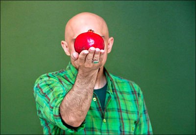
With a pomegranate layout, Nives Widauer participated in this exhibition. Her layout included a context from Ilma Rakusa, a Swiss author, a picture in a size of 80*60 cm and a pomegranate that was brought from Brazil to Iran laid out on white stands and the green wall of the gallery played the role of its background. This paragraph written in the catalogue explains more about her artwork: The Swiss artist Nives Widauer has her personal approach to a pomegranate tree. The windows of her studio faces the garden of Iran Embassy in Vienna. This tree made her commence a research on the identity of pomegranate, a story of the pomegranate in different cultures and religion. The Swiss author Ilma Rakusa will join this project with an article about her imaginations from pomegranates.
Nives’s artwork neither has structuralistic nor narrative approach. It is an exhibition of tendency between the viewer and the artist’s idea. The artist uses a pomegranate in this artwork and by using the different descriptions that the pomegranate has in different cultures, asks the viewer help her for completing a part of this project by taking a photo from him/herself while holding a pomegranate in his/her hand and sending it to the artist (of course choosing the frame for photography is free).
The artist appears in a messenger-like role and brings “the peace and friendship” message for different religion and asks her followers to sign under this declaration with a photo from themselves with a pomegranate.
Of course I was one of the signers.
With the artwork named “7 Saints”, Clemens Krauss shows series of pictures. The size of the pictures are 25*40 cm printed with the chromogenic color techniques. This is the paragraph explaining this artwork in the catalogue: For the photographic series “7 Saints”, Clemens Krauss has chosen young people from all over the world who are currently in Berlin. They share a kind of androgynous appearance – women seen to be men and vice versa. This ambivalent state refers to body and identity as fragile phenomena. Mythological concepts can become metaphors for the body and the violence inflicted upon it. In the series “7 Saints” Clemens Krauss chooses Christian iconography and language as symbols for more overall ideas of corporality.
With their especial techniques, it is like that the pictures are asking a question, the figures that in general compression of the artwork from formalistic point of view appear in form of a full body figure with something in their hands are put in the middle of the frames. In this artwork, Clemens Krauss by considering the media from which he benefits, neither he has structuralistic nor traditionary approach, his approach is more research-like than interactive. The artist appears as a questioner and helps the viewers understanding his question better by recording his figures in the media area of picture. The background of the pictures are free from anything.
Black color covers all the background, even the shadows of the figures are not visible. The clothes of these figures sometimes introduce a man and sometimes a woman in different cultures. But these clothes are chosen in contradictory to the figures sex. Clemens asks a general question: by passing the time what happens to identity?
The Clemens artwork occupies a wide area in terms of iconography3 and even iconology4.
Constantin presents a layout different in form, his layout shows a cloth installed on the wall of the gallery on which there was a linear drawing drawn with a fabric marker. In this artwork, Constantin undertakes no special form, his artwork has the ability to shape in any form, and in parallel of those lines Constantin’s drawings are affected.
Now it is better to note a paragraph describing more about Constantin’s artwork that has been written in the catalogue and then we will discuss more about it: Similar to electronic data streams, Constantin Luser organizes his drawings similar to self-analogues geometrical figures and matrices of the artwork. He creates micro and macro storyboard pictures. Closeness and farness are brought on to one and the same level of perception; faces, muscles, and blood vessels gather around structure elements of cities, developing into a map of a ubiquitous visual reservoir that time and again alludes to the artist’s own biography.
Formally when Constantin’s drawings are arranged in a readable and cohesive mode (considering solidarity of lines), shows human-like forms, or parts of human body separated from a human figurative coherent amongst forms and constructions made by human.
Storyboards, in the first glance, may follow a narrative story, but being more patient, Constantin wants to show a narrating performance approach. The Constantin’s artwork has more a theoretical approach to art. An artwork that can demonstrate an abstract artwork in another form, an artwork which is more like a criticism from art to art and emphasizes on different capabilities of readability that an artwork can have in itself at the same time. Maybe this aspect of the Constantin’s artwork is more attractive than other aspects for me and reveals this artist’s smartness facing this challenging issue in art (multi-dimensionality and multi-readability in art).
Of course, for those who prefer narration to form in an artwork, one can have a narrative approach to it. Also his video is screened in approximately 10-inch frame with a digital video player. His video, from visual and structural viewpoint, had many grace and attractions.
It is noticeable that the designs used for making this video benefit from the ones available in an ancient encyclopedia from Hitler era. First we discuss generally about the story this video has and then will review it structurally.
Everything starts from a red point, a point with a special form almost in the middle of the screen, it is like that the point is floating on the liquid like water, then a flower pot and after that plants cover the previous layer (the red point in its base), the plant grows and covers all over the screen. The artist draws the viewer’s attention toward the root of the plant (the movement of the video elements are vertically upward). A human having a woman head and a body having lots of men and woman heads, again the viewer’s attention is drawn toward the bottom of the screen (based on previous explanation), from this human like, human infant is born.one infant, two infants, and three infants… . The infants move on a circle ring.
The lines start drawing mechanical tools and machineries on another screen, mechanical gears, compass, … a story of technology and knowledge development, until the animated drawings are put on each other layer by layer, human and plant layers (mechanical tools and machineries) these layers are merged and then make a total, a total seams, suspended, like floating on moving water weightlessly and rocking up and down. A total which is like an abstract painting. Then the layers become colorless and pale and this paleness of black lines prepares a basement for the frontier layers, birds on branches on the first scene of the screen parade and the eagle, a prey bird in the middle of the screen, that the feather lines emphasis on the power of this bird on the screen, then these layers pale too and again we see a suspended and fluid contexture.
This is a smart video from the beginning, growth and development of different kinds of plants and human talk about industrial revolution and awareness growth in all era till now, and has a story from the effects each era had another one. Sought different layers of the era on the earth, looked to the earth like a supervisor bigger than it, but considering its detail with some creatures.
Constantin may have god-like approach in making his artwork, but he was only a narrator not a messenger and not even a forecaster and this is one of the strong points of this narration.
Structurally, linear drawings, with different linear validation, triangular composition that slowly cover all the frame of the screen. The layers which themselves are a passage for their outer layers, with an atmospheric perspective that with movement of any drawing layer on other layers takes the viewer deep down and then brings him/her up (this perspective is made by beneath layer losing color and diminishing the contrast of the screen.
By retaining the drawing media identity, Constantin was able to have an accent with another media language, with video language, and interestingly in this artwork no media affects the other one and has not been lost, and both of them coordinately in their identity role efficiently make a coherent total with each other, even narrative approach of the artwork does not have a heavier strength than its structural approach.
The voice of the video moves along with the whole artwork too. An opera in which a screen is put on another one, the rhythm of a music stronger than the previous screen music (here the same visual atmospheric perspective in the artwork is aurally understood) overlaying of the screens on each other, and at last the pitch that is another emphasis on narrative aspect of the artwork.
The perishable artwork by Vooria Aria is a layout from different slates context that were laid decussated like chessboard squares on the floor of the gallery by the artist and also two frames made an aluminum composite with a stone on it installed on the wall.
The paragraph that is written in the catalogue for this artwork is: The slate which the artist Vooria Aria uses for his current artworks functions as object and also as trace. Slate is a fine grained stone, composed of volcanic ash. In Vooria Aria’s native city Sanandaj, traditional graves are usually arranged with slate. The stone is composed of various very thin layers, easy to be broken, easy to perish. In Vooria Aria’s artwork the stone is used in analogy to the topics of migration and social issues in our society regarding identity. Vooria’s attention to the contexture of the layer, the slate layer and placement of any layer on another one and its fragility nature talks about his Avant-garde approach in his artwork. Using from materials that have the capability to change identity from objective to subjective, in some squares of this layout, Vooria completely powdered the stone and in some others cut it to some parts, therefore, with Vooria’s meddling in any squares of this chessboard, the stone demonstrates different contextures of itself and any contexture in a different experience for the viewer and this difference in contexture give narrative approach to the artwork and challenges the viewer to have story for him/herself, a story that can be completely personal or not.
The two frames installed on the wall next to this layout act like that too. Some stones in different sizes on an aluminum composite screens. Oblique scratches that move on the surface of these screens between the small and big stones create a movement scene on the viewer, a sense out of halt and stop over, but a movement which is disharmonized and unbalanced in itself.
The video named Hohenrausch (Mountain Trip) was another artwork by Siegfried A. Fruhauf which has been shown in Vista5. This video which has been shown in a 2*1 cm frames with a video projection created a big postcard sense in a postcard size in the viewer’s mind. The paragraph written in the catalogue for explaining this artwork is: (In Siegfried A. Fruhauf’s Hohenrausch (Mountain Trip) scrolling images of postcards of the famous Austrian Alps mountain are screened, in this artwork, sound and image, he invites us to question nationalistic stereotypes of landscapes and culture and their often awkward and embarrassing representations.
Tetramerous arrangement of pictures besides each other on a screen and 180 degree rotation of them on the screen and with very quick movements of any picture to another one, the postcards have a new translation from reviewing the explained scenes. Siegfried A. takes away the visual identity of any card and gives an unusual visual identity to them by laying them besides each other.
In Siegfried A.’s artwork, in a ready made6, the postcards have a special capability of effect of identity challenge in the viewer’s mind.
Usually the postcards introduce a special place and culture, but Siegfried A. uses this characteristic and using his ideas gets the explained culture and identity from prepared things of himself and shows an uncertain visual identity in all the artwork. He does not seek introducing any new cause and effect but benefits from Saussure7 Linguistic System and demolishes the cause and effect relations.
The postcards, in another viewpoint, usually show a moment from a special place. By wafting these moments one after another, Siegfried gives a new characteristic to his Ready modes which is called (Successiveness of Time).
In the whole artwork, Siegfried was able to take away the previous known time and identity by harmonizing the video and sound and involve the viewer in the gape made from the relations disconnection. This report is the result of accumulation of the available information and in the exhibition.
References
1- Antoine de saint Exupery, French author and pilot, (1900 – 1944), style: autobiography
2- The Little Price (Le petit prince), one of the most important works of Antoine de saint Exupery in 1940 which has inspired from a real event that the confabulation of Mauritania desert sands occurred to the author.
3- Adams Lavrie Schniede, The Methodology of Art, ch. 7. Translator: Ali Masoumi, (Tehran, Nazar pub, 2014) third ed.
4- Adams Lavrie Schniede, The Methodology of Art, ch. 7. Translator: Ali Masoumi, (Tehran, Nazar pub, 2014) third ed.
5- Vista; it is the name of a part of Vista Gallery which is a separate space apart from the Gallery hall (a room of 3*3 m)
6- Ready Made; Cf. footnote 17, p. 270; The Art of Modernism by Sondro Bocola. Translator: Rubin Pakbaz and et al, 2009, Farhang Moaser pub.
7- Cf. Adams Lavrie Schniede, The Methodology of Art, ch. 7. Translator: Ali Masoumi, (Tehran, Nazar pub, 2014) third ed.
Feuilleton
Routine object and almost industrial production which is selected by the artist and for inspiration of a special thought, to be shown on it without any changes. Marcel Duchamp, the present century artist used the division of this phrase in United States and emphasized on its difference with found object. After that, the followers of pop art and conceptual art used the prepared objects a lot.